
The Art Direction of Hecticube
Although I worked on every aspect of Hecticube by myself (excluding the excellent sound design done by George Hufnagl), I wanted to write about the Art Direction in particular because that is what I am well versed in. Game design and especially programming are things I am very new to and I've just been kind of winging it. Maybe one day I'll write about my misadventures through the world of programming to really give you a laugh.
An evolution of the past.


Screenshots from Shapes & Sound: The Shape Shooter
As a lover of aesthetically stimulating design, I decided that Hecticube would be a slight departure from the last game I art directed (Shapes & Sound: The Shape Shooter, which was developed by myself and two other Jamaicans under the name ARRG Studios), at least in some aspects. Shapes & Sound shares a similar aesthetic in that it is very minimal and geometric. We had decided however that we were going to go against the grain and stick with a fully monochromatic colour palette. It was a very fun yet challenging design limitation because it challenged me to create minimal graphics that had to stand out on their own without the use of any colour whatsoever. This meant that I couldn't rely on colour to save any visual flaws, but instead I had to make everything as polished as I could.
Squares, squares everywhere.

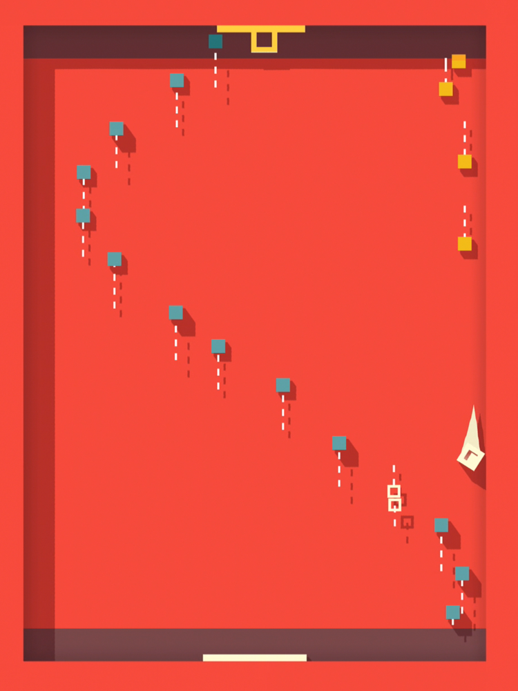

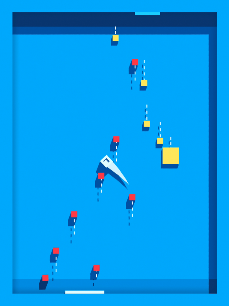
Taking the geometric nature of Shapes & Sound and simplifying it even more, I put design limitations on myself to make every element in the game entirely out of squares (though Hecticube is actually made entirely of three dimensional objects, for the purpose of this post we're going to pretend that everything is flat) as well as to not use any textures or patterns. I broke the first rule in a few places, namely with the play / back icons which are triangular, as well as with the game's text. Everything else, however, has a simple four sided face, and there are no curves in the game (again, with the exception of the text).
Visual preferences.

Since Hecticube is so minimal, I wanted to really push the visuals by adding very vibrant colours throughout the game. Still, I limited myself to nine themes that the player could pick from, each consisting of five colours - the main colour, the secondary colour, a colour for each player's bullets, and the brightest colour which was usually very close to pure white, used for the main cube and for text. Further pushing the visual design, I decided that I didn't just want to use the default Unity shadows but I wanted to utilize a custom material instead which would give me full control over each object's main colour and shadow colour. The end result was that I could make the shadows more rich and saturated, or, I could make them a completely different colour all together from the original colour, making the game feel even more artistic.
It has a pulse.
For those who don't know, I come from a motion graphics background, and so I am a huge fan of a wide variety of animation styles. I am also one who believes that it's all in the details. "Every mickle mek a muckle" as Jamaicans would say, meaning everything adds up to make the final product. Coming from that background in coherence with having a keen eye for details, it was imperative that Hecticube was rich with animation. I didn't want to just make the game work and stop there. I added animations, no matter how minute, in every single area that I could find that would benefit from it. Don't get me wrong, I wasn't going to add animations just for the sake of adding animations - less is more - but if an animation could further polish the game or especially if it enhanced the player's understanding of the game, it was added.

My ultimate wishes for Hecticube is that you and everyone else has a wonderful experience with it and that it will forever resonate with you. However, if for some reason the game just isn't for you, I at least hope that you enjoy and appreciate the visuals it has to offer.